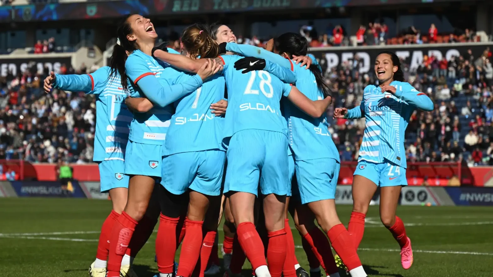
As the 2024 NWSL season nears its end, the Chicago Red Stars are preparing for the postseason. However, next season, the team will have a new name: Chicago Stars FC, starting in 2025.
This change follows a new chapter for the team, which was bought by Laura Ricketts, co-owner of the Chicago Cubs, last summer. The team also welcomed a new head coach, Lorne Donaldson, who was the former manager of Jamaica’s national team.
The rebranding will include a new crest and merchandise with the new design. The updated crest is different from the Chicago flag, which inspired much of the original Red Stars branding with its blue-and-white stripes and red six-pointed stars.
Chicago’s chief marketing officer, Kay Bradley, explained to The Athletic that Ricketts had planned the rebrand when she purchased the team. It has been in the works for six months.
“The wheels were turning, but obviously we didn’t want to rush it,” Bradley said. “This is a really big moment as we think about the course of the last 12 months of the club. It felt like the right time to signify the future and all we believe is ahead of us from a progress perspective.”
The new look is not only about a fresh start for the team but also about raising awareness in the community. In a video shared on the Red Stars’ social media, the team highlighted the goal of the rebrand: to get more recognition.
“Hey, Chicago,” the video started. “You know this town. But do you know this team?” The Red Stars have shown the greatest improvement in the league this season.

After finishing last in the standings in 2023, the team has earned a playoff spot in 2024. (They are currently sixth in the standings with one game left.) The team set a record this summer with over 35,000 fans attending a match at Wrigley Field.
The new branding aims to help the Red Stars stand out in a competitive sports city like Chicago and make it easier for fans to recognize the team.
“How do we connect this club more closely to the city, if not in proximity, but in ethos and find that emotional connection?” Bradley said. “That was also the reason for pulling stars out (of the last crest), pulling ‘Red’ out of the logo.
Often people shorten our name to ‘Red Stars’, and then the ‘Chicago’ goes away. So by removing ‘Red’ from the name, the short version will be ‘Chicago Stars’, so that we keep that connection with our city.”
The team also consulted with players and fans about the rebrand, seeking their input on what to keep and what to change.
Chicago is now joining other original NWSL teams that have undergone rebrands. NJ/NY Gotham FC, formerly Sky Blue FC, made its change in the 2021 offseason. Seattle Reign FC, which changed names twice due to a location move and a sale to the OL Groupe, returned to its original name and crest this season after another sale.
The Washington Spirit, another original team, will also reveal a rebrand next year. Other teams, like the North Carolina Courage, rebranded after moving to a new city or returning to the league.
